ELEMENTS
Scroll down to learn about the key elements of the Archer brand identity.

Logo
The Archer logo is the most important expression of our brand so don’t alter, colorize or separate it.
Its composition provides a sense of dynamism and movement.
The A and E have been carefully crafted to share similar characteristics to the symbol, itself designed from the letter A, unifying the two elements.
Logo Clearspace
To preserve integrity always use the correct clear space around the logo.
Use the A of the wordmark to determine the clear space requirement.
MINIMUM WIDTH
Print width: 1 inch
Standard display: 75 px
Retina display: 150 px
Logo Colors
The logo comes in black or white. Use the version of the logo that gives most contrast to the background you’re using.
Don’t alter the color of the logo.
DEEP BLACK
HEX: #000000
RGB: 0 0 0
CYMK: 75 68 67 90
PMS: Process Black
BRIGHT WHITE
HEX: #FFFFFF
RGB: 255 255 255
CYMK: 0 0 0 0
Fonts
There are just two versions you’ll need to use:
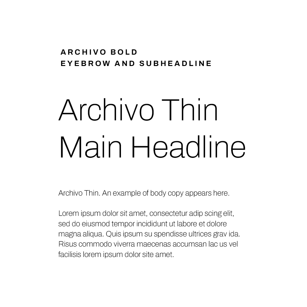
Archivo Thin
Archivo Bold
Font Application
For titles and body copy use
Archivo Thin
Title case or sentence case
For eyebrows and subheadlines use
Archivo Bold
All-caps
Tracked out
Color
The three main brand colors are:
Bright White: Which has a clean futuristic feel
Technical Sand: Provides a sense of warmth and connection to the earth
Deep Black: Accent color used for text and other top level graphic elements
BRIGHT WHITE
HEX: #FFFFFF
RGB: 255 255 255
CYMK: 0 0 0 0
TECHNICAL SAND
HEX: #E5E0D9
RGB: 229 224 217
CYMK: 9 9 13 0
PMS: 400 C (50%)
DEEP BLACK
HEX: #000000
RGB: 0 0 0
CYMK: 75 68 67 90
PMS: Process Black
Imagery
Archer imagery has an advanced, human and positive tone.
Download images from the library and use them to help create a connection between your work and the viewer.


