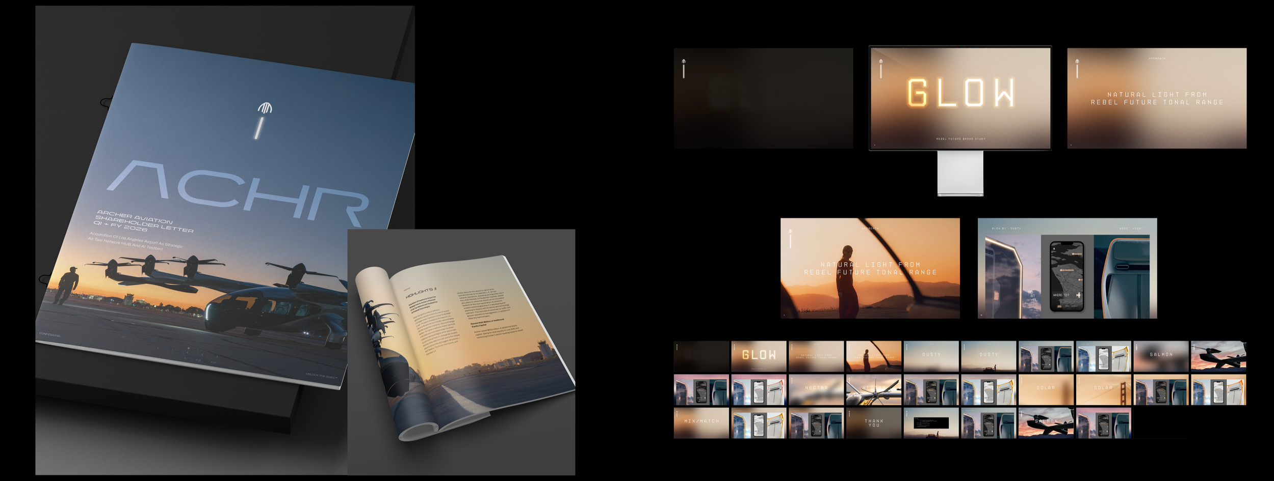
IDENTITY PRINCIPLES



PHOTOGRAPHY
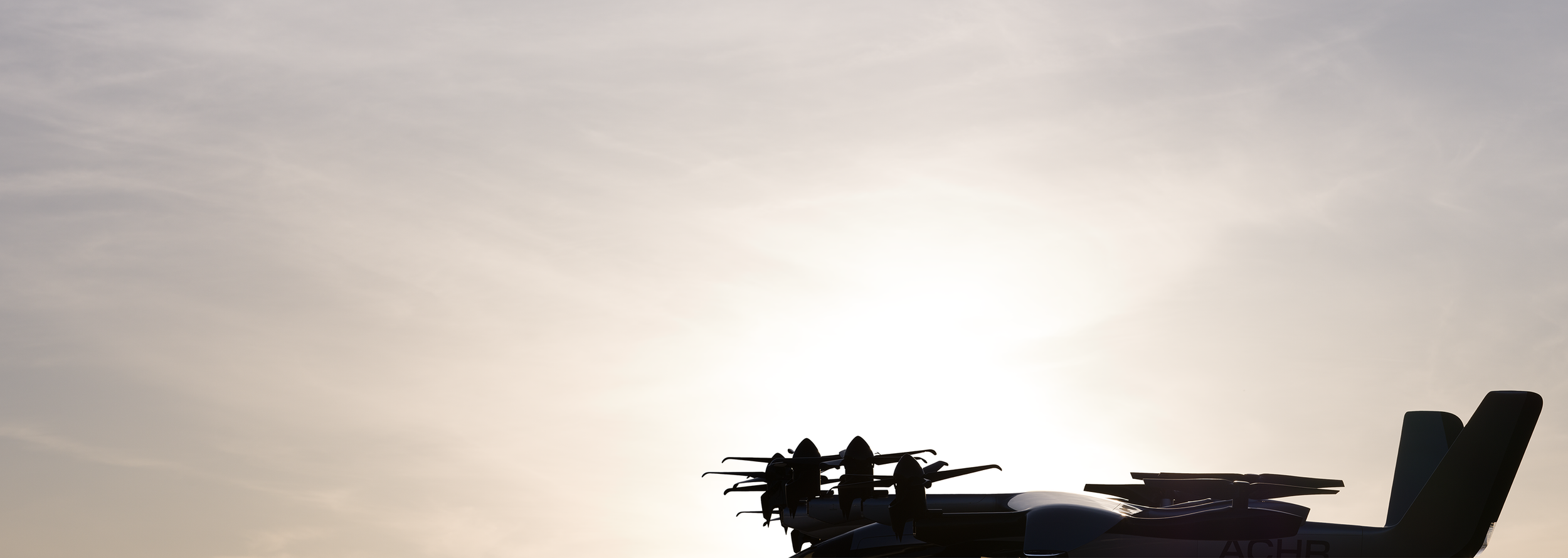
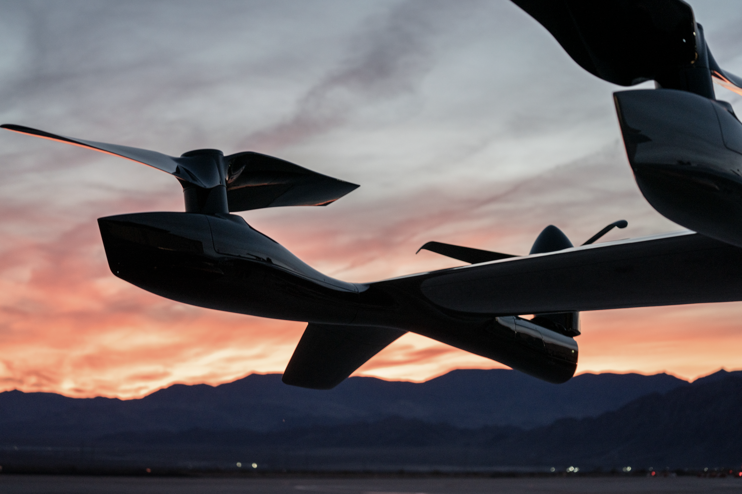
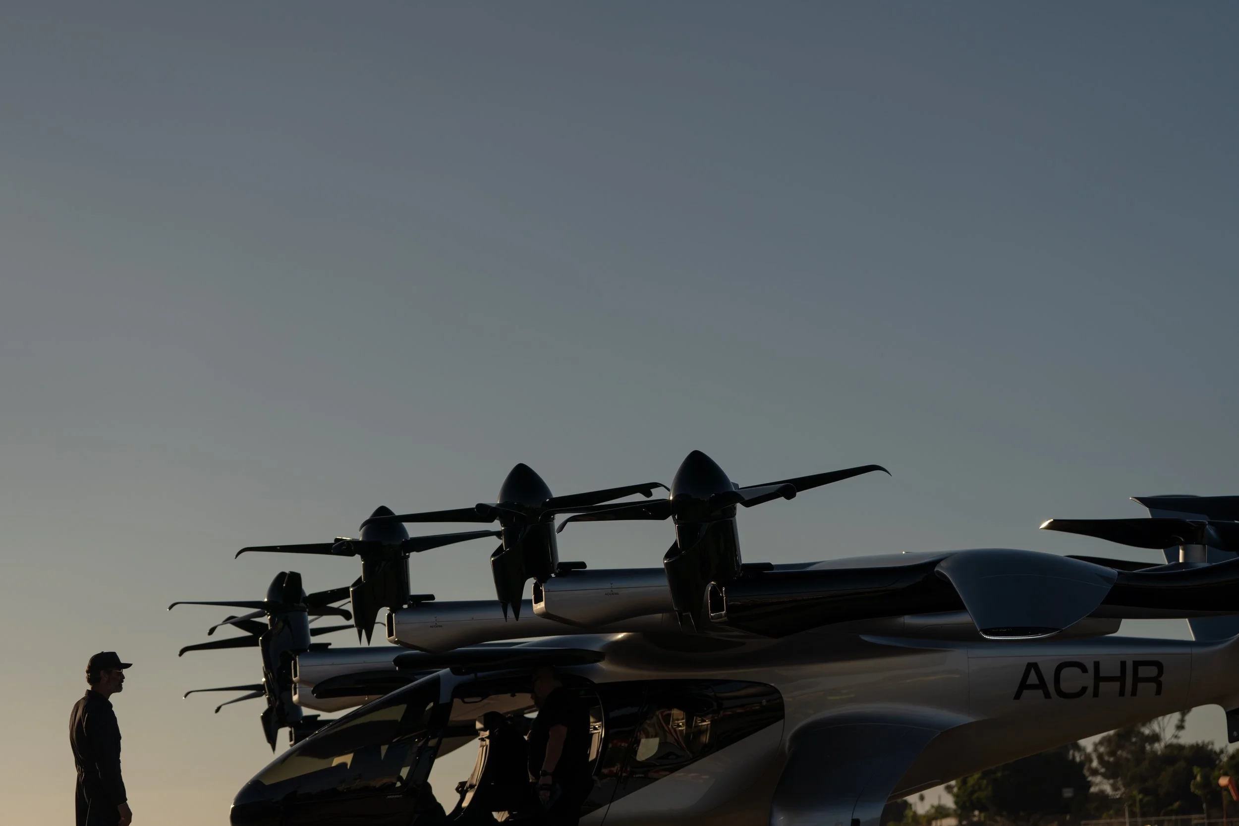
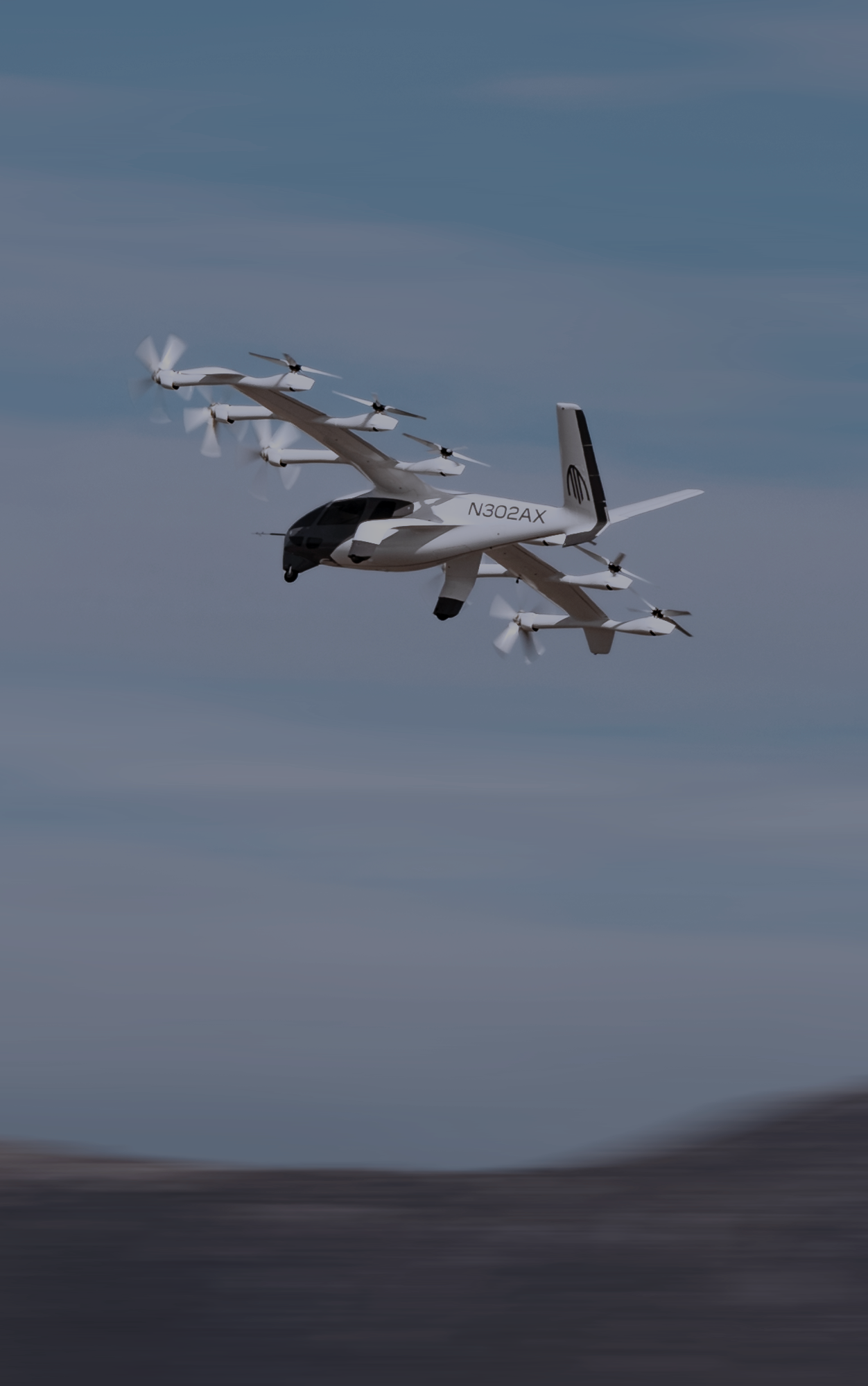
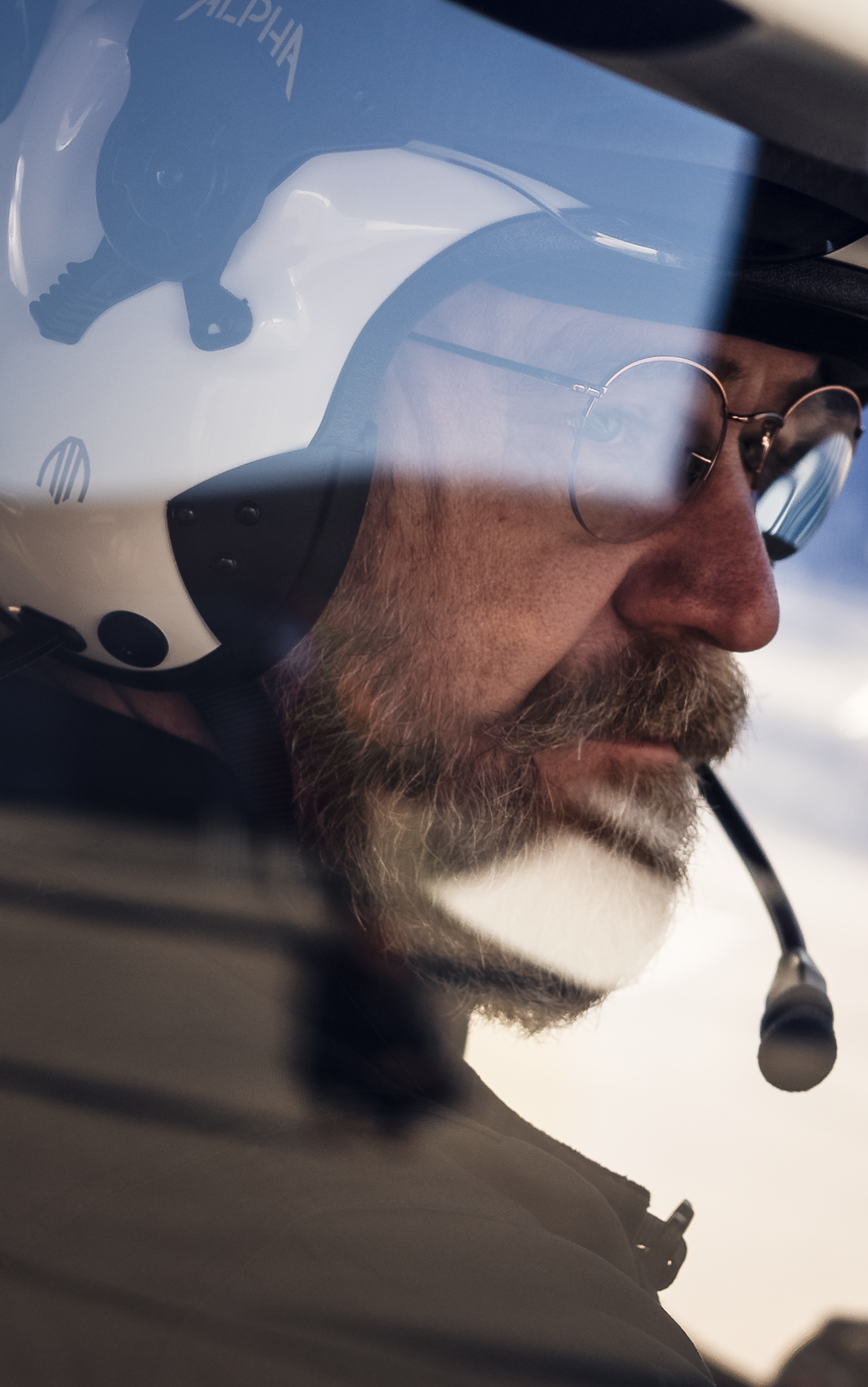
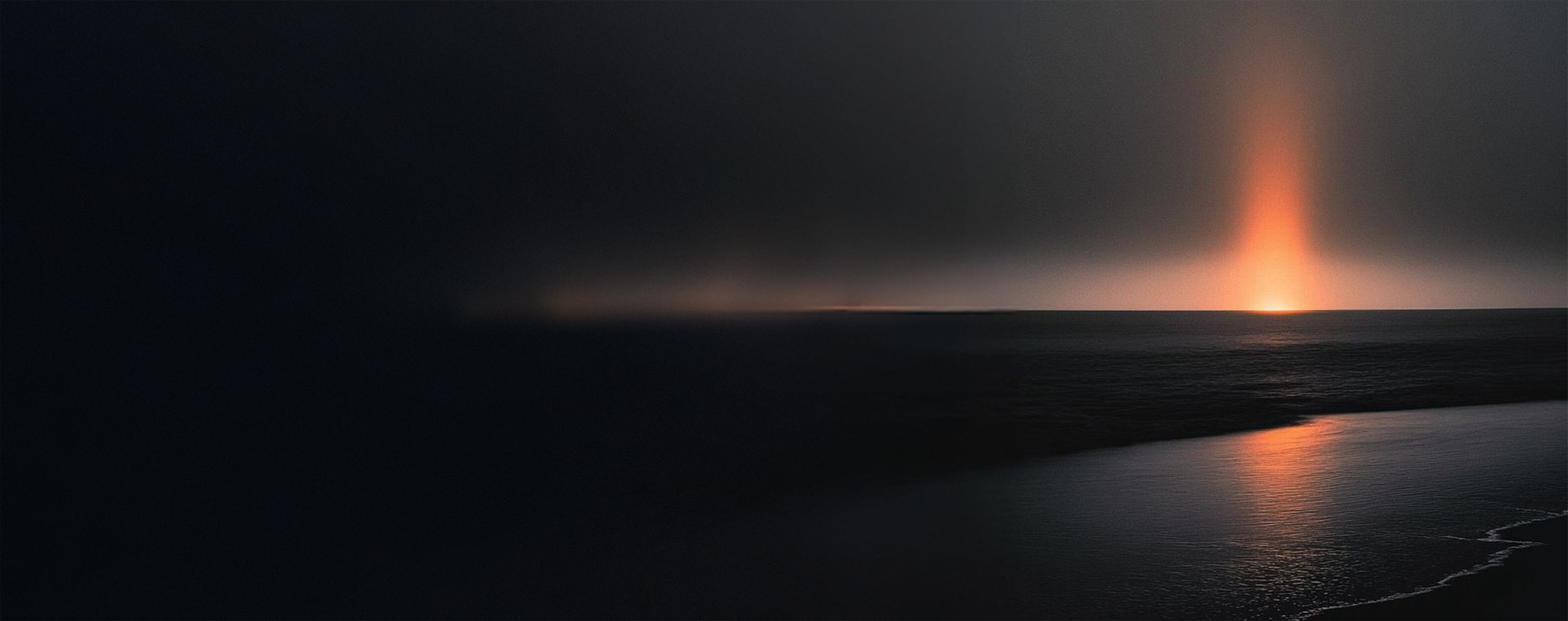
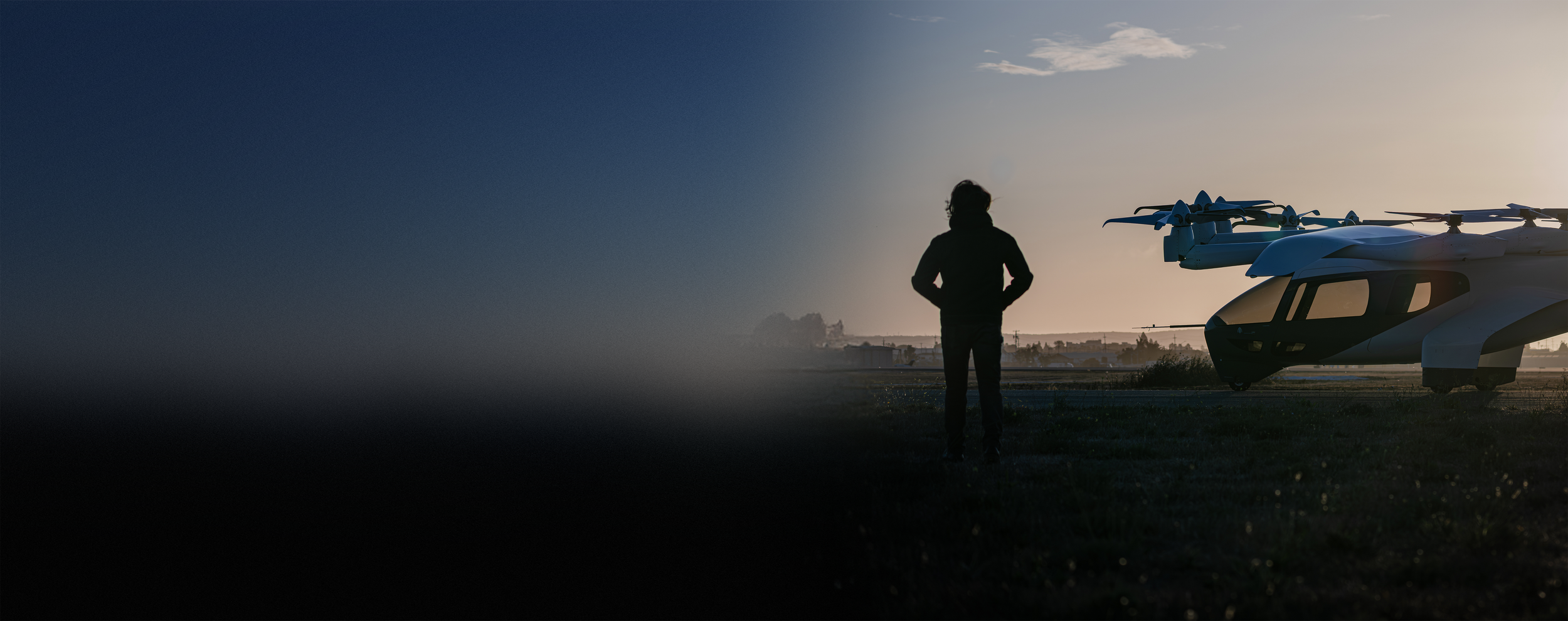
The Rebel Future identity is a photography–driven identity
The following principles hold true for all brand photography
THE QUALITY OF LIGHT THROUGH TIME

— Infinite backgrounds
— Back-lit silhouettes
— Liquidity through reflections
— Elegant gradients
— Provocative framing
— Medium format


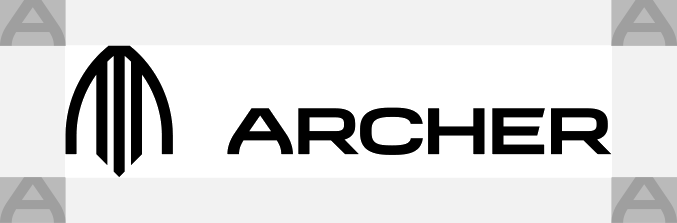
Archer Lockup
Layers of abstraction:
— A for Archer
— Arrowhead
— 2 wings + 3 landing gear (1 front + 2 rear)
Clear space:
— Always use the correct clear space around the lockup to preserve its integrity
— Use the A of the word mark to determine proper clear space
— Minimum print width: 1 inch
— Minimum display: 75 px



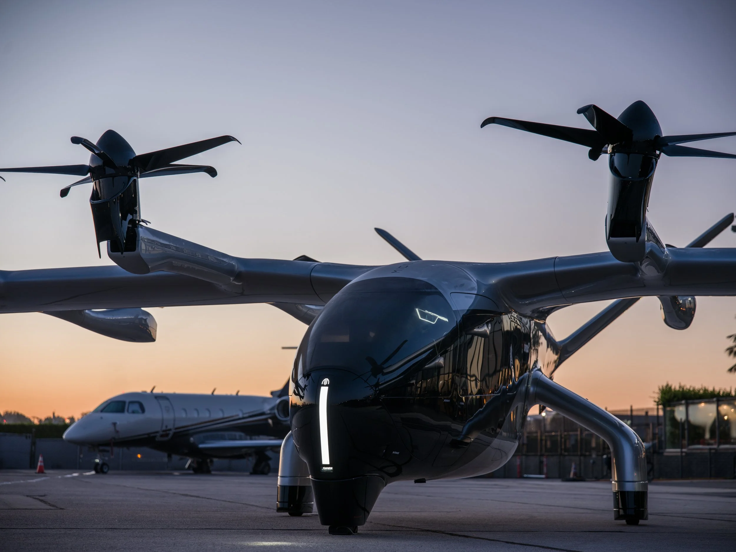
Archer Beacon
— Derived from the signature lighting of Archer vehicles
— Glowing vertical light that symbolizes energy, change and grit
— A signal to rebel against the status quo

INFINITE EDGE
— Imagery should have one edge that elicits limitless potential

SKY TONES
— Archer’s color palette incorporates tones derived from the skies in our photography
— It is not a strictly defined set of colors
— Solar glow is our focal color



AERO GRAPHICS
— Graphics that evoke aerospace
— Functional way finding and navigation



DISPLAY FONT
— Advanced aerospace-inspired typeface for Rebel Future display and headline treatments

BODY COPY FONT
— Features verticality, legibility and elegance to complement the width, technicality and
character of the Ligione display font


DATA FONT
— A technical and structured font inspired by aerospace heads-up display graphics
— Used for data and informational text



SOLAR GLOW
— A functional accent color born from aviation
— Usage includes way finding and areas of emphasis
Examples
Print Material
Presentation Deck